Using Colour Combinations in Fabric
Colour in fabric has the power to shape how a room feels long before furniture is placed. It softens architecture, creates rhythm, and brings warmth through repetition and contrast. When approached thoughtfully, colour combinations don’t overwhelm a space — they give it depth and ease.
Rather than thinking in terms of statements or accents, fabric colour works best when layered slowly, allowing tones to relate to one another over time.
Start with a Grounding Tone
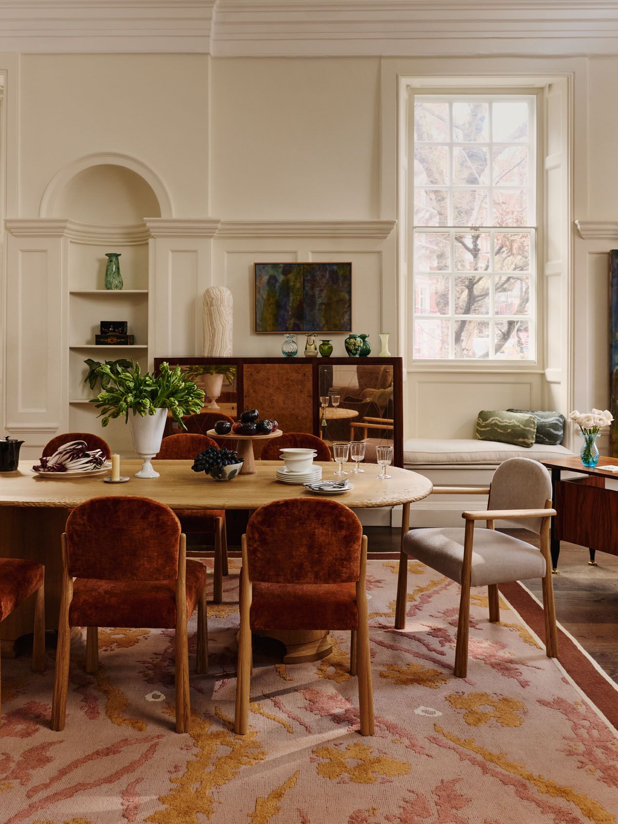
Every scheme benefits from a foundation. Grounding colours — warm neutrals, natural fibres, and softened earth tones — give fabric combinations somewhere to rest. These tones often appear in larger elements such as upholstery, rugs, or drapery, setting the mood of the room.
At Sister, plains like Sacha Linen in neutral tones or the gently textured Atlas Linen Velvet provide a solid backbone for richer colour combinations. These tones bring quiet solidity without overwhelming other elements
Build with Adjacent Colours
Successful fabric combinations often sit close to one another on the colour spectrum. Blues layered with blue-greens, rusts paired with terracotta, or olive sitting beside ochre all create harmony without feeling flat.
Warm earth tones like Patch in Umber lend rich, natural weight. Cooler painterly tones such as Odessa in Fen echo the sky’s soft variation. Mid-range dusty hues like Odessa in Savanna and Odessa in Citrine bridge warm and cool elements.
This approach keeps a scheme cohesive while still allowing variation in tone and depth. Interest comes from subtle shifts, not contrast alone.

Working with Bolder Colour
Bolder colour combinations can be just as balanced when handled with restraint. Deep reds paired with warm pinks, saturated blues layered with inky greens, or mustard set against earthy browns create energy without overpowering a space.
The key is to vary intensity rather than hue alone — allowing one colour to lead, with others supporting through softer or darker variations. When bold colours are used together, texture becomes especially important, helping to soften the overall effect.
Use Pattern to Carry Colour
Pattern is a useful bridge between colours. A patterned fabric can introduce multiple tones at once, helping different elements feel connected. Patch fabrics — with their energetic, traditional-inspired stripes — and Disa prints add graphic movement and anchor other colour choices. Painterly or irregular patterns are particularly effective, as they blur the edges between colours and allow stronger hues to sit more comfortably together.
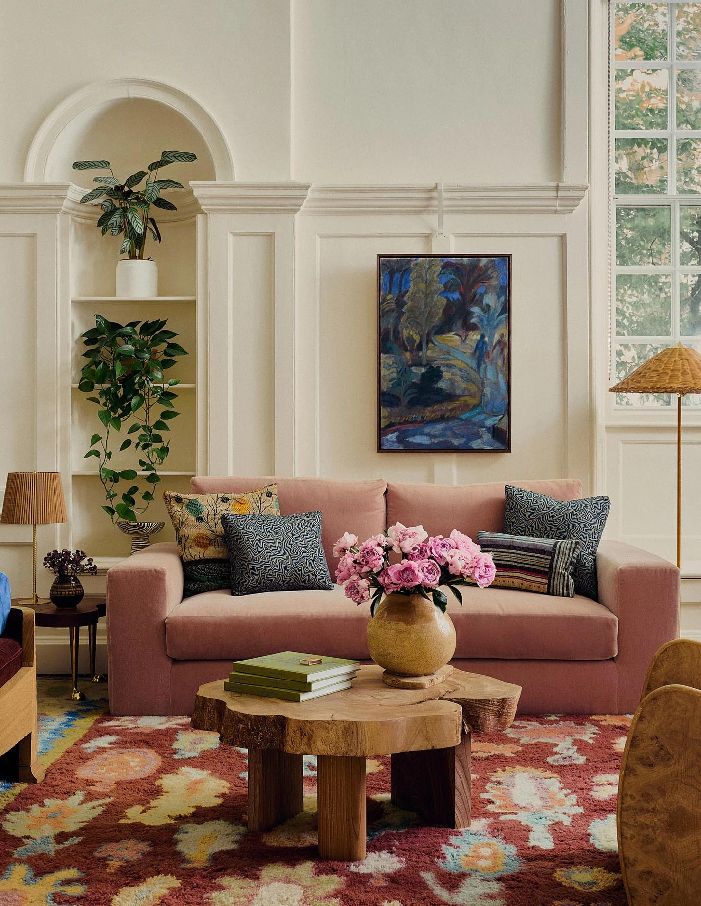
Balance Light and Weight
Colour has weight. Deeper tones feel grounding and enclosing, while lighter hues lift a space and create contrast. When layering fabrics, balance heavier colours with lighter ones to keep the room from feeling dense.
This balance can be achieved through scale — a richly coloured sofa offset with lighter cushions, or a patterned rug grounded by simpler textiles around it.
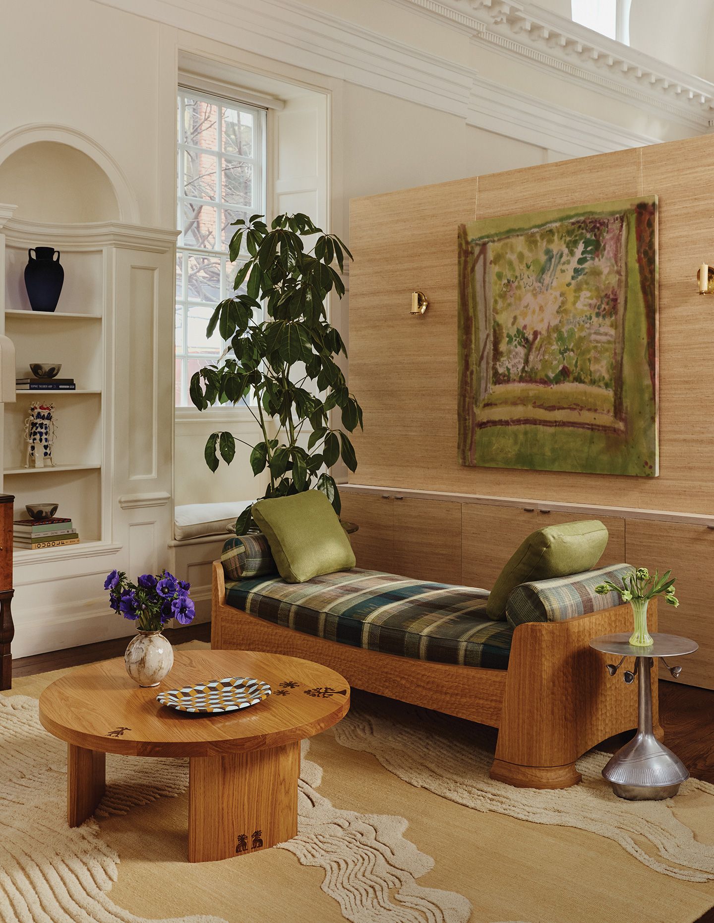
Let Texture Do Some of the Work
Texture plays as important a role as colour. Velvet, linens, and blended fibres absorb colour differently, adding nuance even within a restrained palette. Fabrics like Ismay Bouclé or Marci Mohair introduce subtle variation in volume and surface, allowing colours to feel softer, more atmospheric and lived-in. These can act as a bridge when pairing stronger hues with calmer tones.
Balance and Repetition
Repetition is what makes colour combinations feel intentional. Rather than matching fabrics exactly, allow tones to reappear in different ways across a room — echoed in upholstery, cushions, and rugs.
A colour introduced in Patch in Vermillion might resurface subtly within Odessa in Savanna, or a softer note in Odessa in Fen could be reinforced through a textured plain such as Sacha Linen. These connections need not be obvious; even a shared warmth or undertone can create cohesion.
It is this quiet repetition — not symmetry — that gives a scheme rhythm. Colours relate to one another without duplicating, allowing a space to feel layered, balanced and composed rather than staged.
Flexibility and Change
Colour in fabric should feel adaptable. Light, time of day, and activity within a room all influence how colour reads. Choosing combinations that work across layers — and allowing room for edits over time — helps interiors evolve while remaining cohesive.